Are you looking forward to establishing an emotional connection with your target audience for better brand recall and recognition? Do you wish to create a differentiator and be unique or distinctive from your competitors? Are you interested in conveying the brand's personality and brand value?
If the answer to the above queries is affirmative, the concept of "color quotient" in branding will facilitate a significant change for your brand personality. Color quotient signifies the strategic use of color to evoke specific emotional responses and associations in consumers. It is impactful as it appeals to the emotions, values, and aspirations of the target audience.
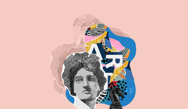
Power of Emotional Design: Uncovering Deep Roots
The roots of emotional design in branding lie in the understanding of color psychology, cultural context, and the emotional impact of design choices. A brand's use of color can evoke specific emotions, reinforce brand identity, and tell a compelling story. It's a powerful tool for creating a lasting connection between a brand and its audience.
Psychology of Color
The roots of emotional design can be traced back to the field of psychology, particularly the study of color psychology. Color psychology suggests that different colors can elicit various emotions and feelings in individuals. For example, ‘red’ is often associated with energy, passion, and excitement while ‘blue’ conveys trust, calmness, and reliability. ‘Yellow’ represents optimism, warmth, and happiness whereas ‘green’ evokes feelings of nature, growth, and health.
Color Combinations
What's crucial in effective branding is not just the individual color but the combination of colors, the context in which they are used, and how they align with the brand's values and message. A successful brand uses colors strategically to create a cohesive and emotionally resonant brand identity. For example, the Titan logo, with its serene blue background and gold typography, reflects trust, reliability, and a touch of luxury. Moreover, this color combination resonates well with Indian consumers, making Titan synonymous with quality and craftsmanship in the watch and jewellery industry.
Brand Identity
Brands use color to establish and reinforce their identity. Consistency in color usage across branding materials, such as logos, websites, packaging, and advertising, helps create a strong and recognizable brand image. When consumers consistently encounter the same colors associated with a brand, they begin to associate those colors with the brand's values and attributes. For example, what comes to your mind when you think of the red color? Many people attribute it to Coca-Cola's ferocious zeal or Airtel's strong and vibrant branding. These companies have mastered the psychology of colors to evoke strong feelings in their customers.
Target Audience
Effective emotional design through color requires an understanding of the target audience's preferences and emotional triggers. Different demographic groups may have varying reactions to the same colors. Similarly, the meaning and emotional impact of colors can vary significantly across cultures and contexts. Brands must conduct market research to determine which colors resonate most effectively with their intended audience.
Brand Storytelling
Brand storytelling is all about crafting narratives that invoke emotions. Colors play a vital role in brand storytelling by conveying emotions, establishing identity, highlighting values, differentiating from competitors, and contributing to the overall narrative. For example, a company that emphasizes sustainability and eco-friendliness may use earthy tones like green and brown to communicate their commitment to the environment.
Adaptation and Evolution
Brands often adapt their color schemes over time to stay relevant and fresh. These adaptations should align with shifts in brand identity, market trends, and consumer preferences while maintaining some level of consistency.
Conclusion
The color quotient in branding is about harnessing the power of color to create a consistent and emotionally resonant brand identity. Furthermore, the roots of emotional design in branding can be traced to the understanding of human psychology, user-centered design principles, and color psychology. The color quotient in branding involves the strategic selection and use of colors to evoke emotions, create brand recognition, and establish a lasting connection with the audience. Undoubtedly, it's a powerful tool in crafting a brand's visual identity and emotional appeal. With Pulp Strategy, you can define your brand identity and goals, and understand your target market and competitors. Moreover, our experts can help you achieve your marketing and branding goals.